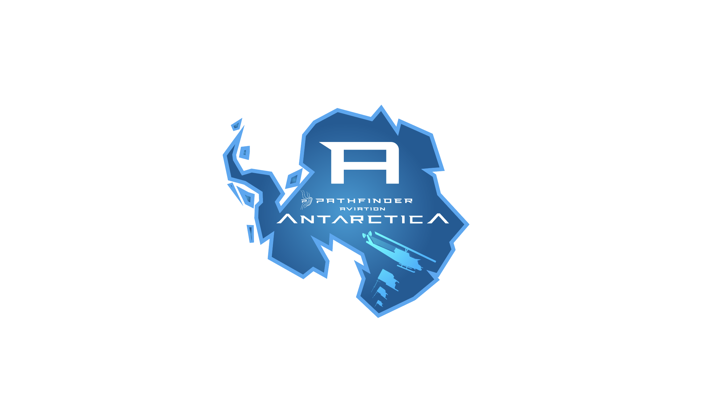
Round 1: Mostly built concept
Notes:
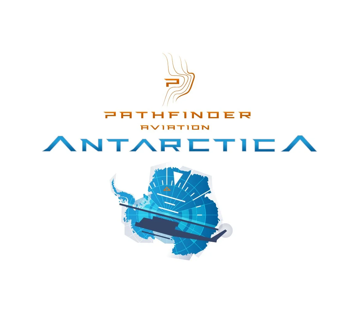
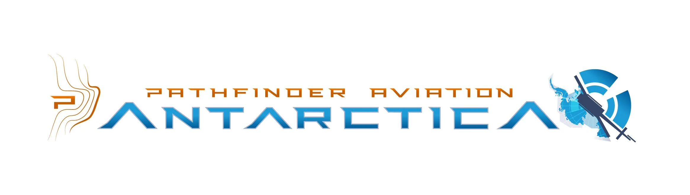
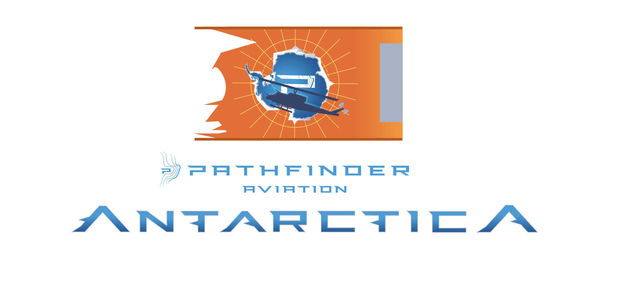
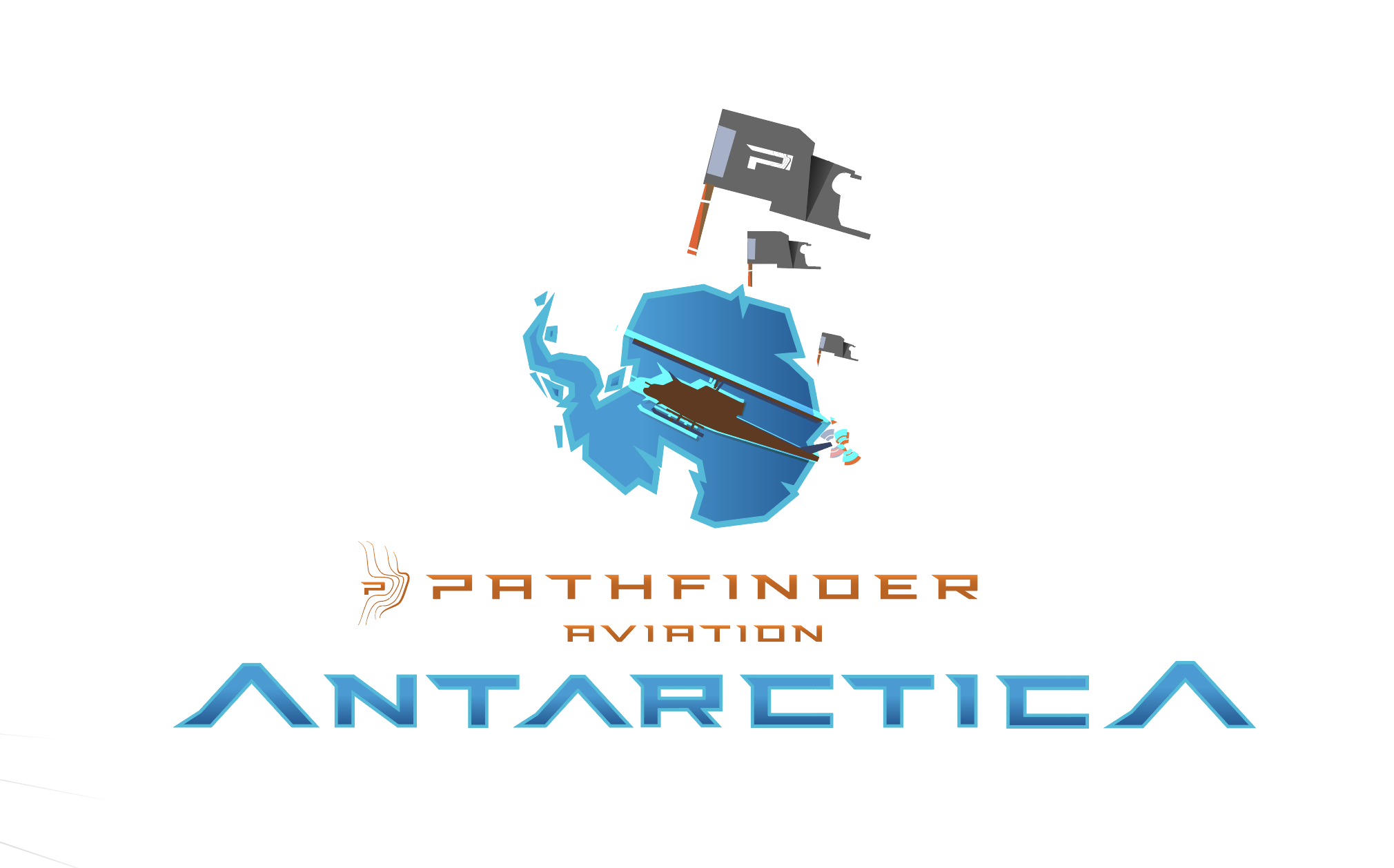
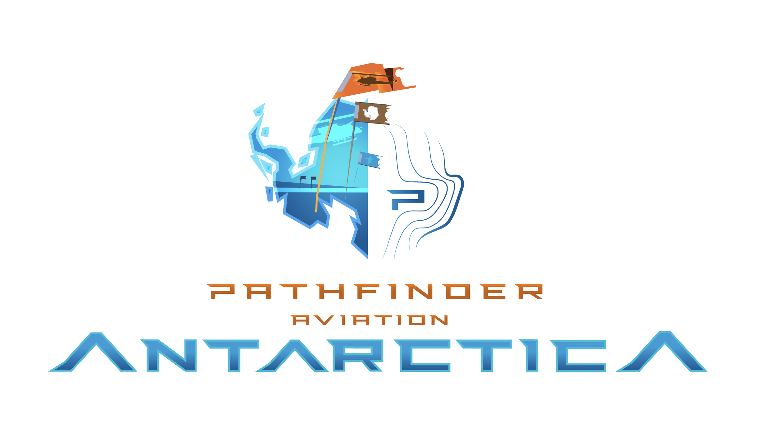
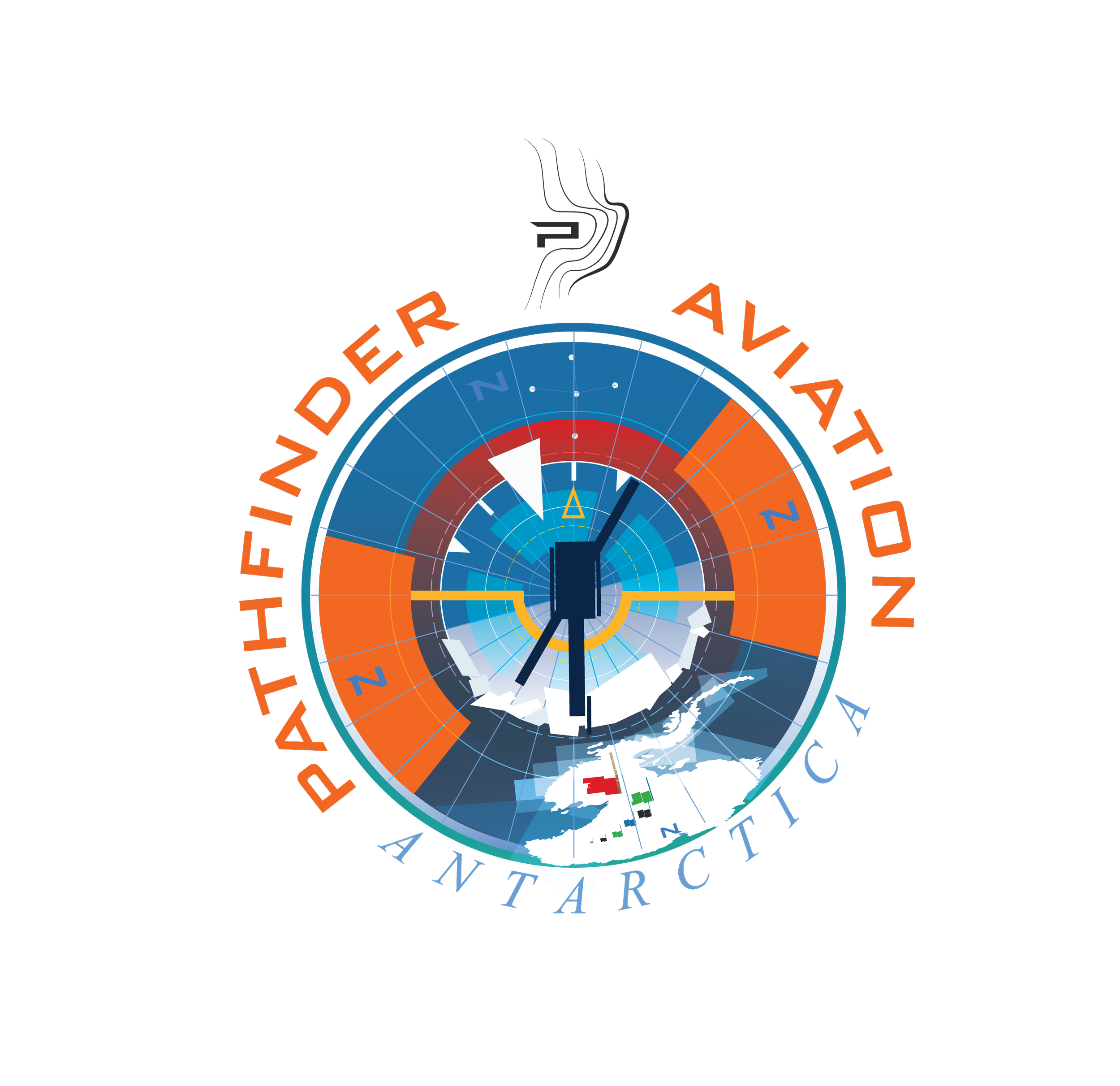
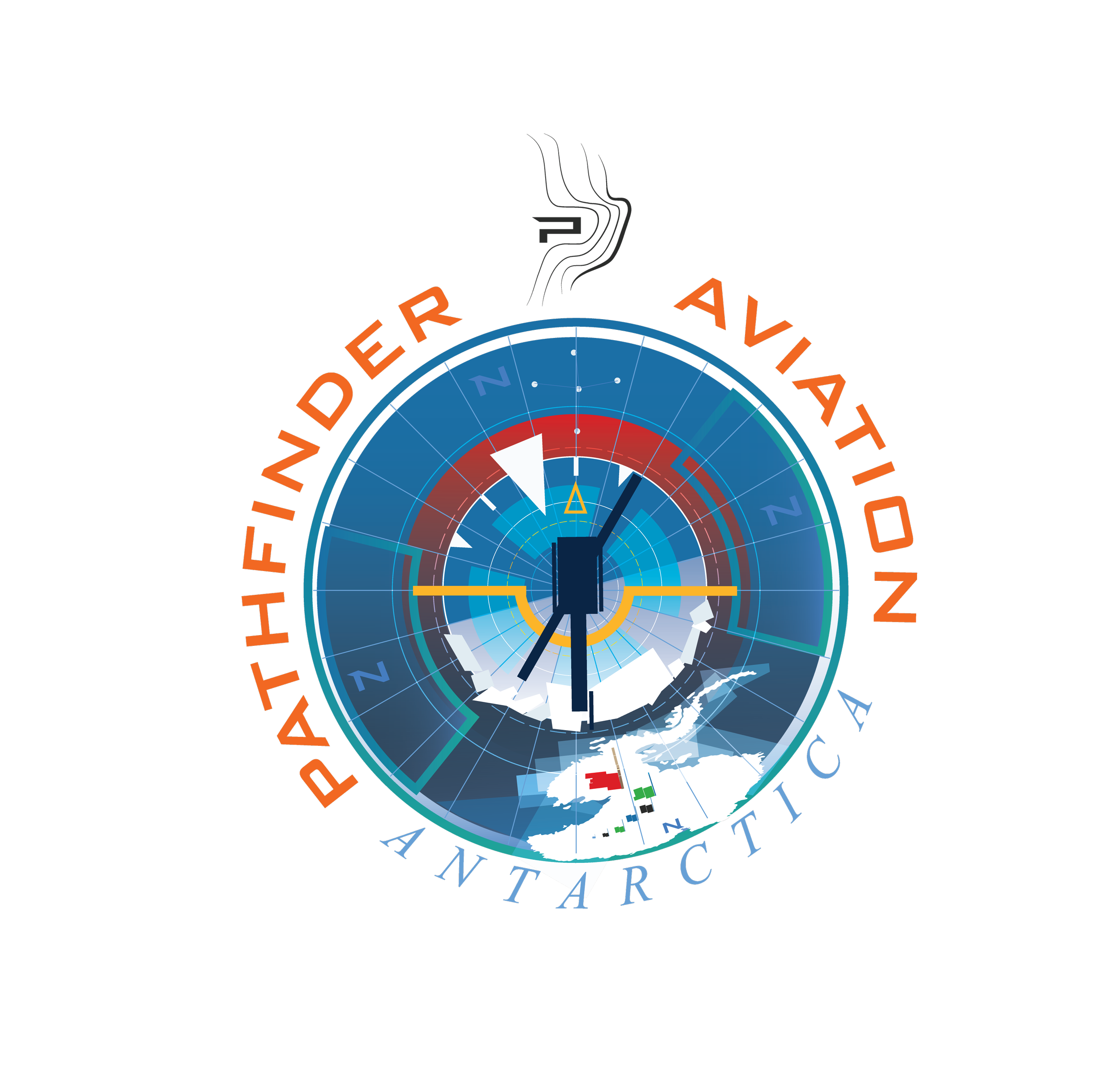
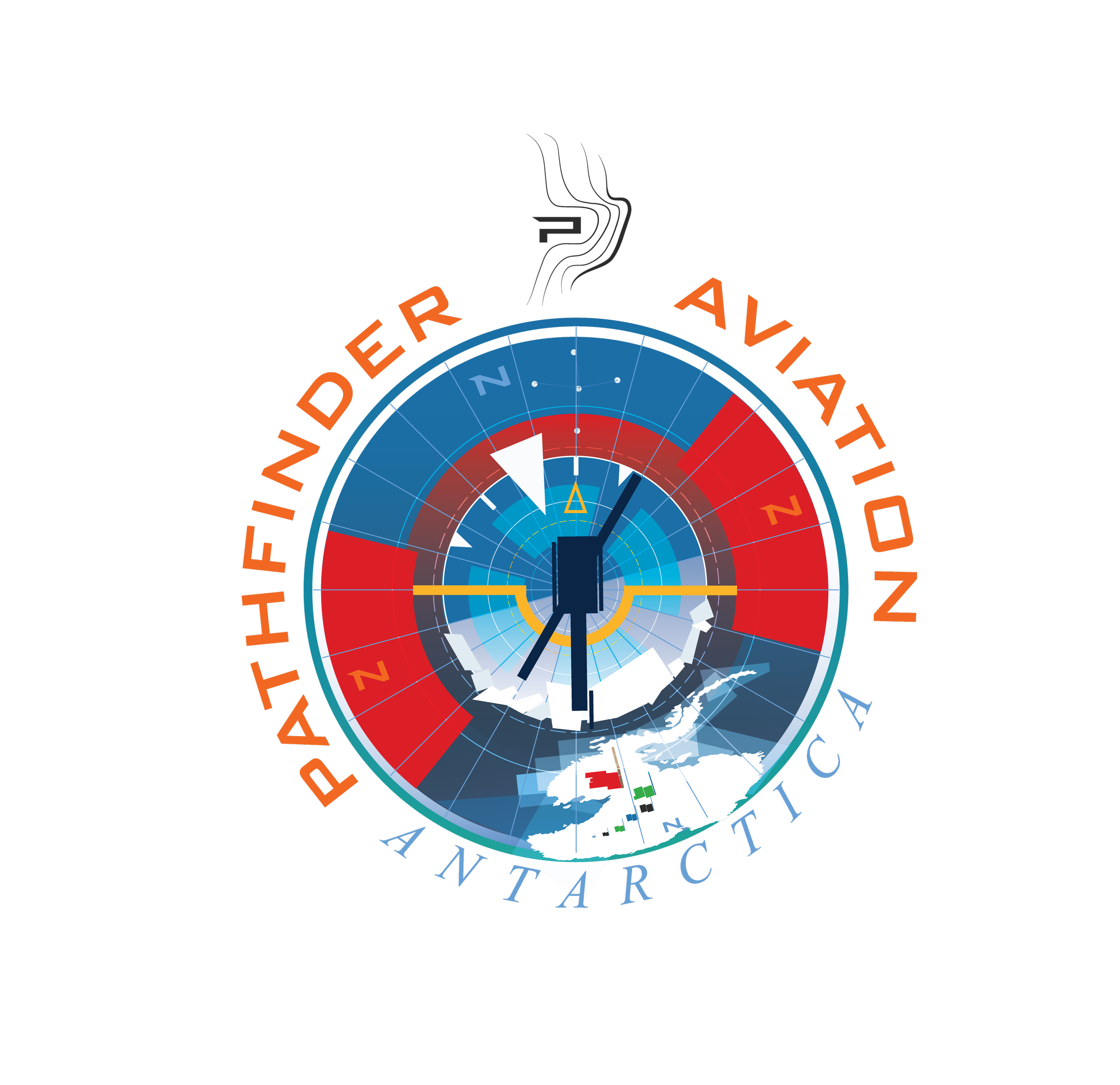
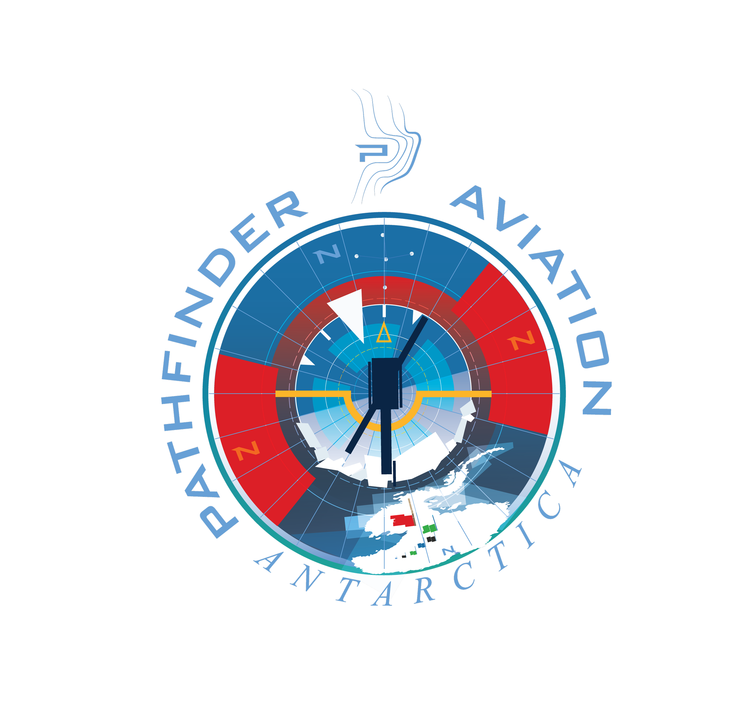
All 4 schemes are identical except for a few color scheme variants (so don’t look for design differences)
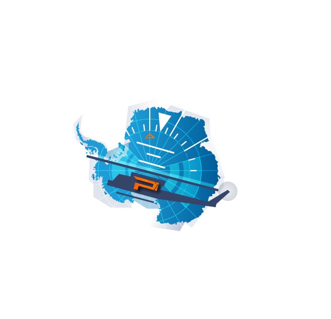
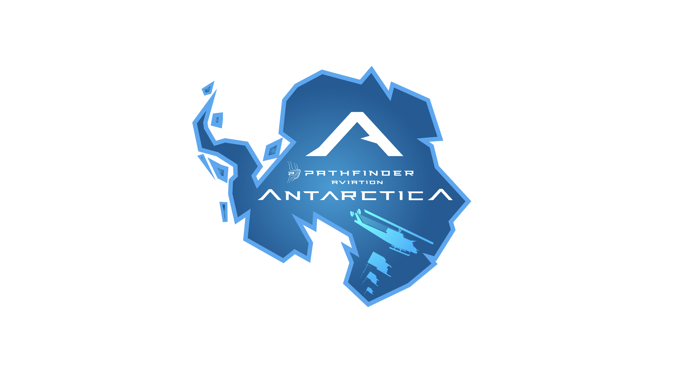
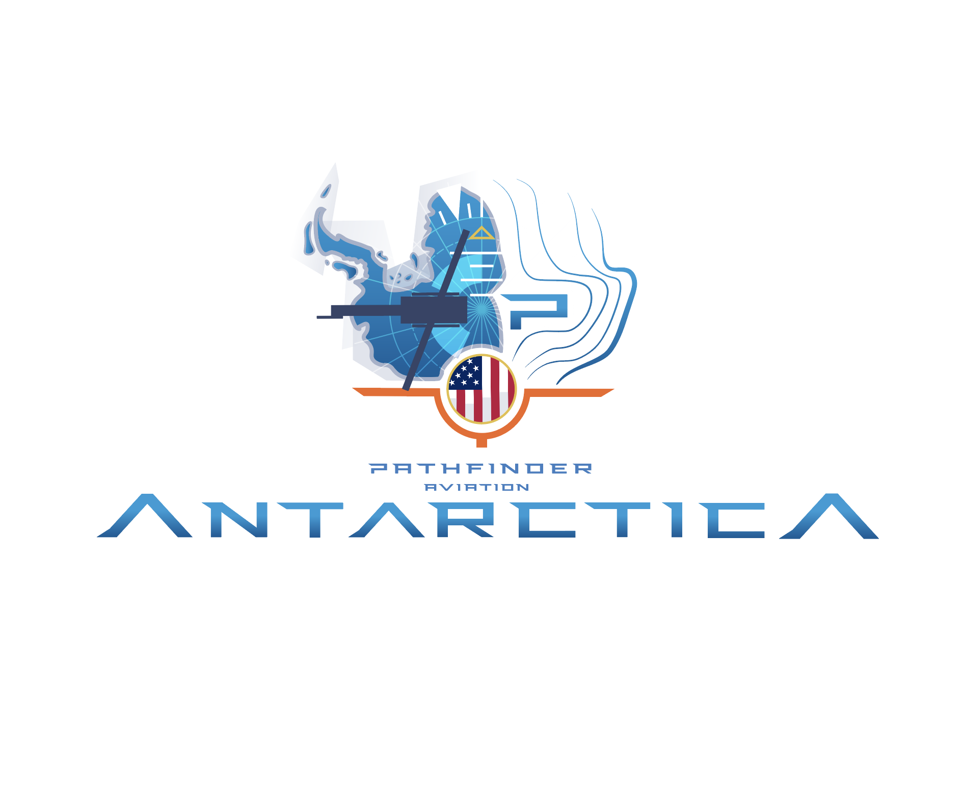
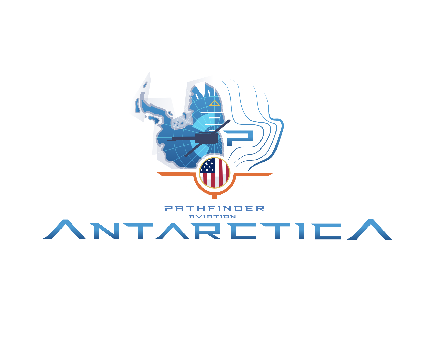
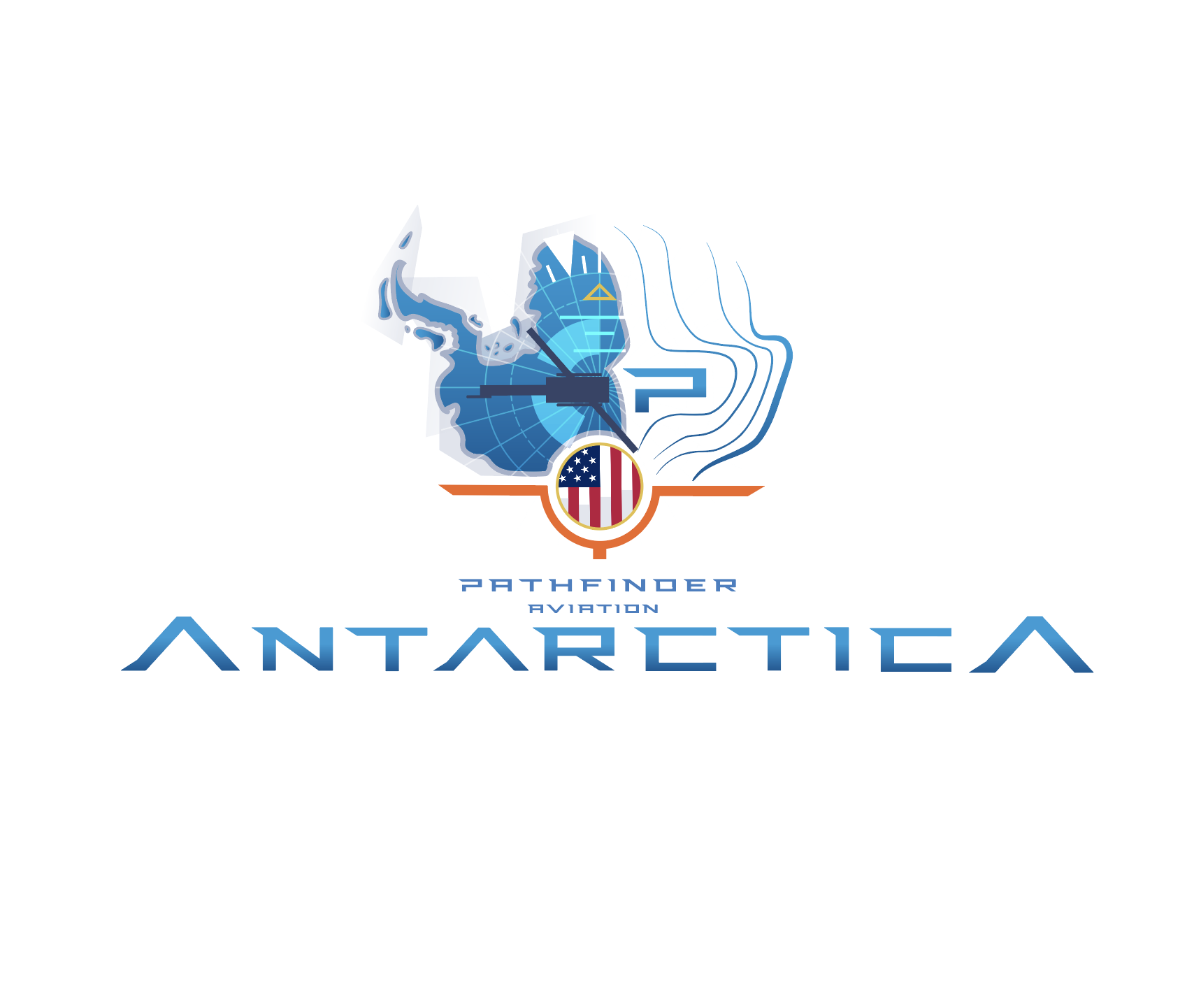
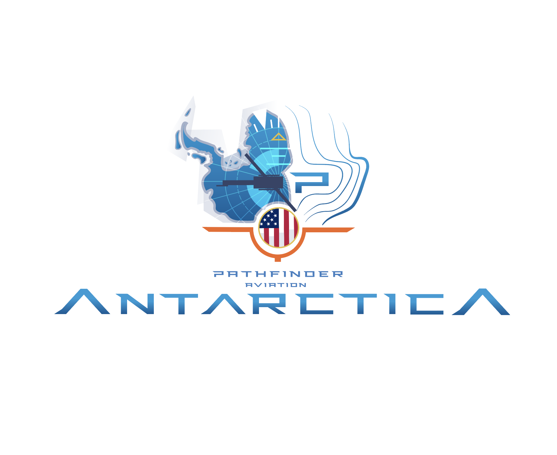
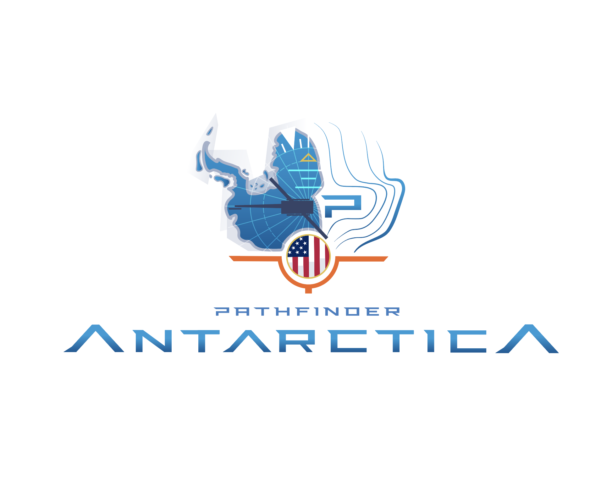
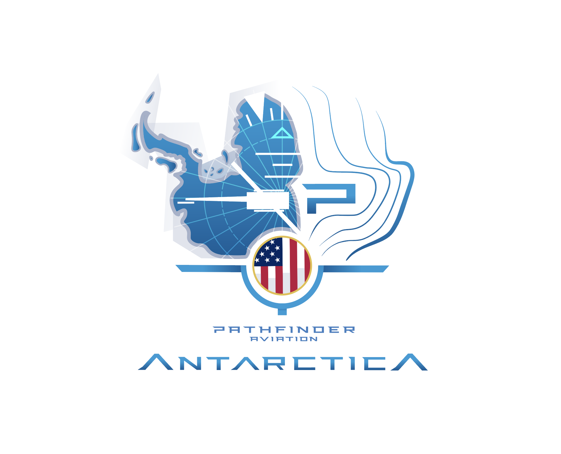
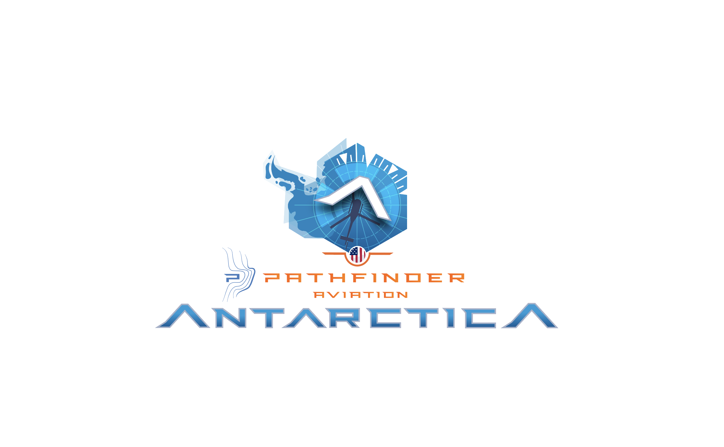
Bell 212 is roughed in for now just to show placement (nose pointing at the Pathfinder logo and yellow “true” attitude indicator
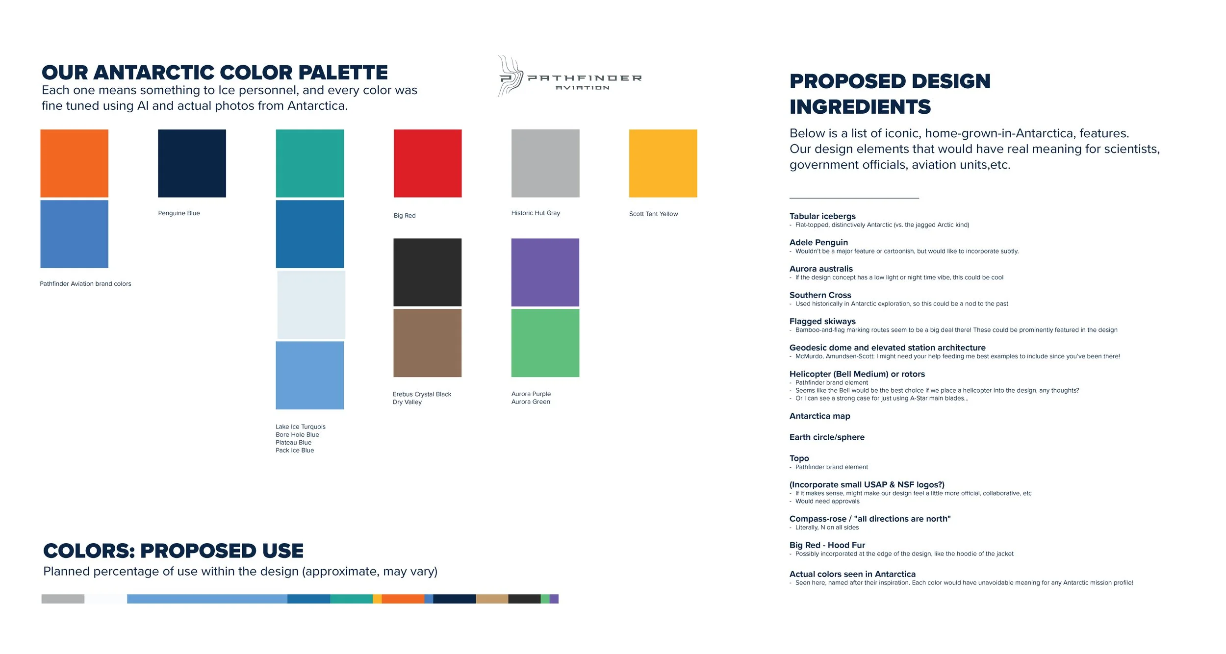
Colors are CMYK designed for print
Design concept themes being projected with one look:
Earth
circle “patch”
atlas/map
exploration
aviation/cockpit
antarctic ice
“upside down”
geo coordinates (lat/lon)
a north-to-south flow for Pathfinder brand
This is a detailed design that can be simplified down to a small or simple logo
There are multiple ways to “see” this design. For example, the heli sillouette could be coming down on your position (scientist PoV), or you could be looking down on it.
This design is meant to feel like it’s in the same family as the new brand badge design I did with Pam https://troydominy.com/pathfinder-badge
***Final thought! Should I drop an American flag in here?! You guys are the only US helicopter operation—should we promote that?
Round 2



Round 3
Notes:
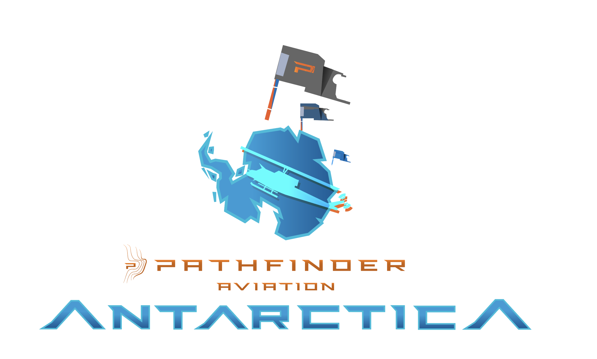
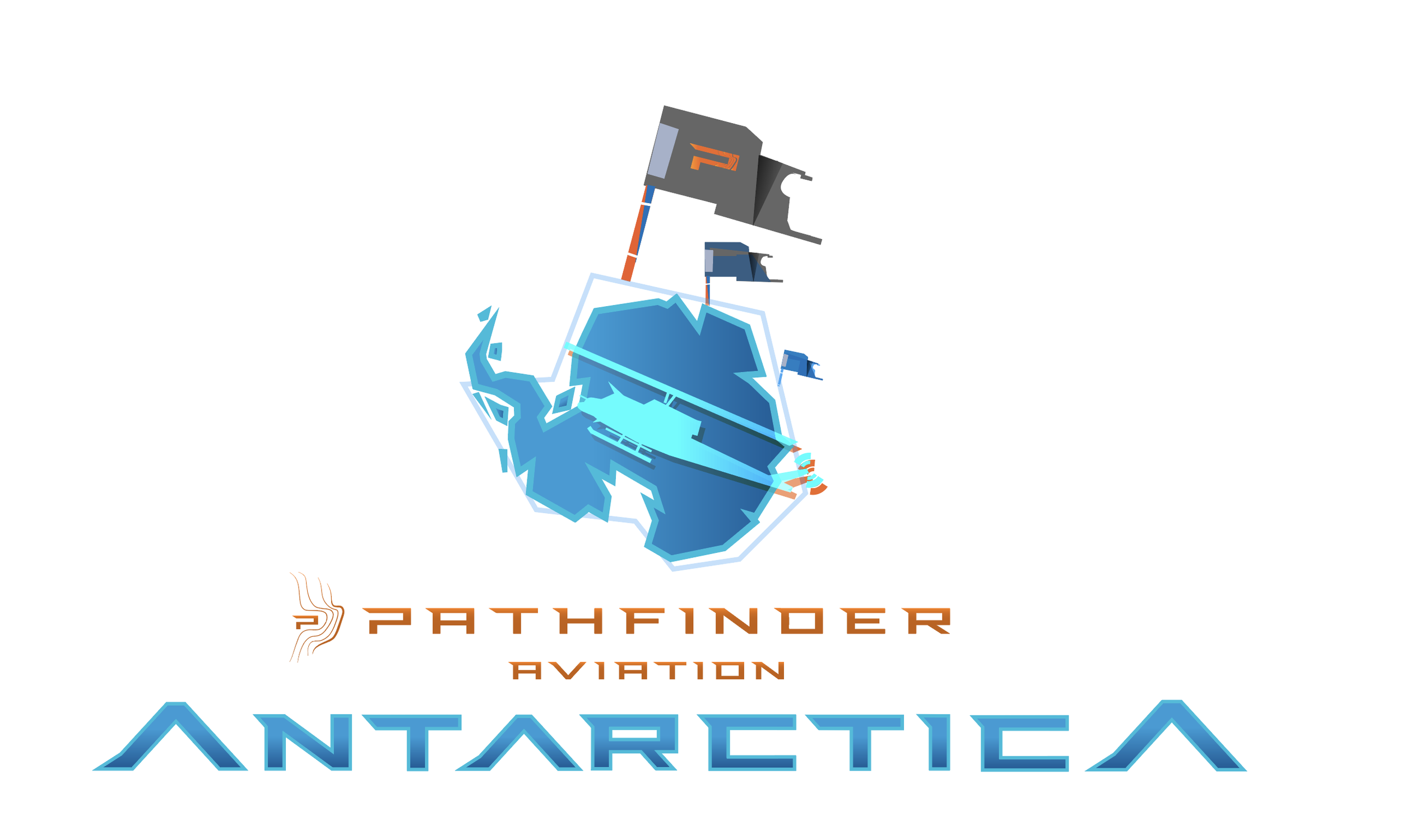
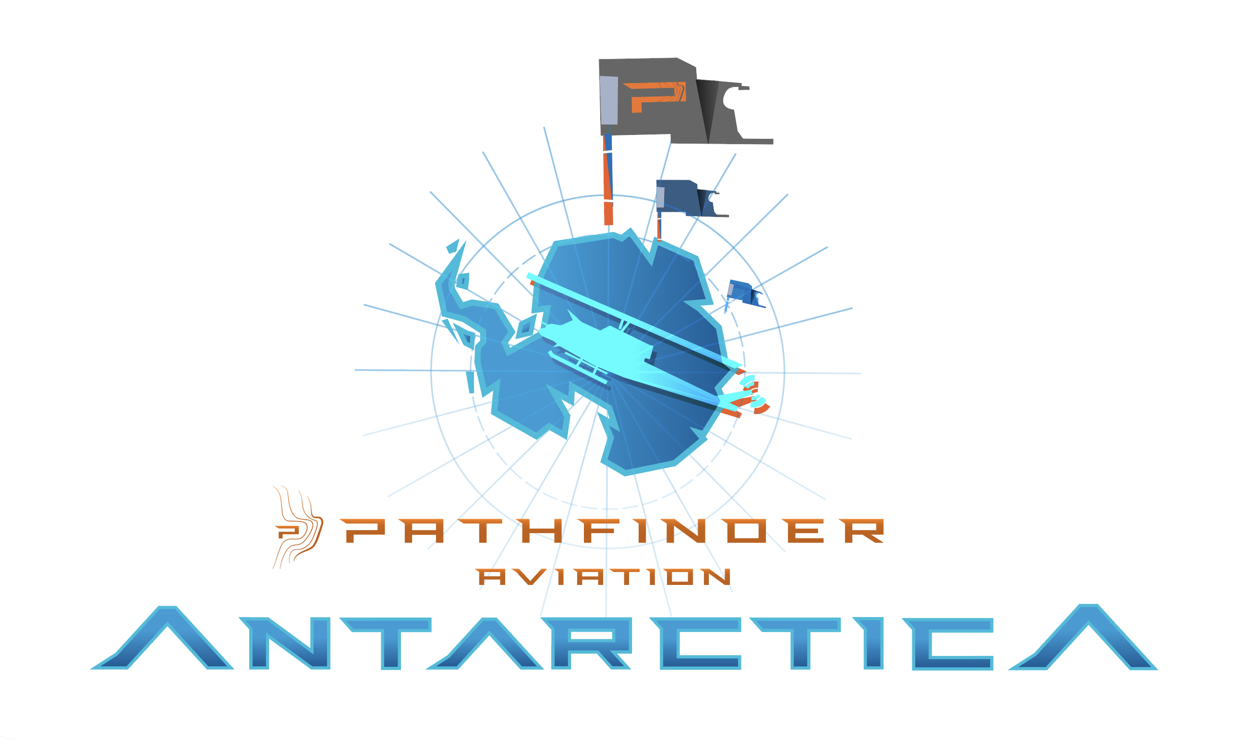
Applied Hailey’s edits…tried to incorp all of them
Note that each new concept variant “set” is clustered as 3, 3.1, 3.2, etc then 4, 4.1, 4.2, etc for the next one.
The Bell 212 is still a bit rough, although I do like its blocky nature. Matches the blockiness of the ice sheets, and the PA brand type
Pathfinder Aviation brand orange note: I’ve darkened 2/3 of it down to a sienna or umber for more contrast when floating above Antarctica over white