

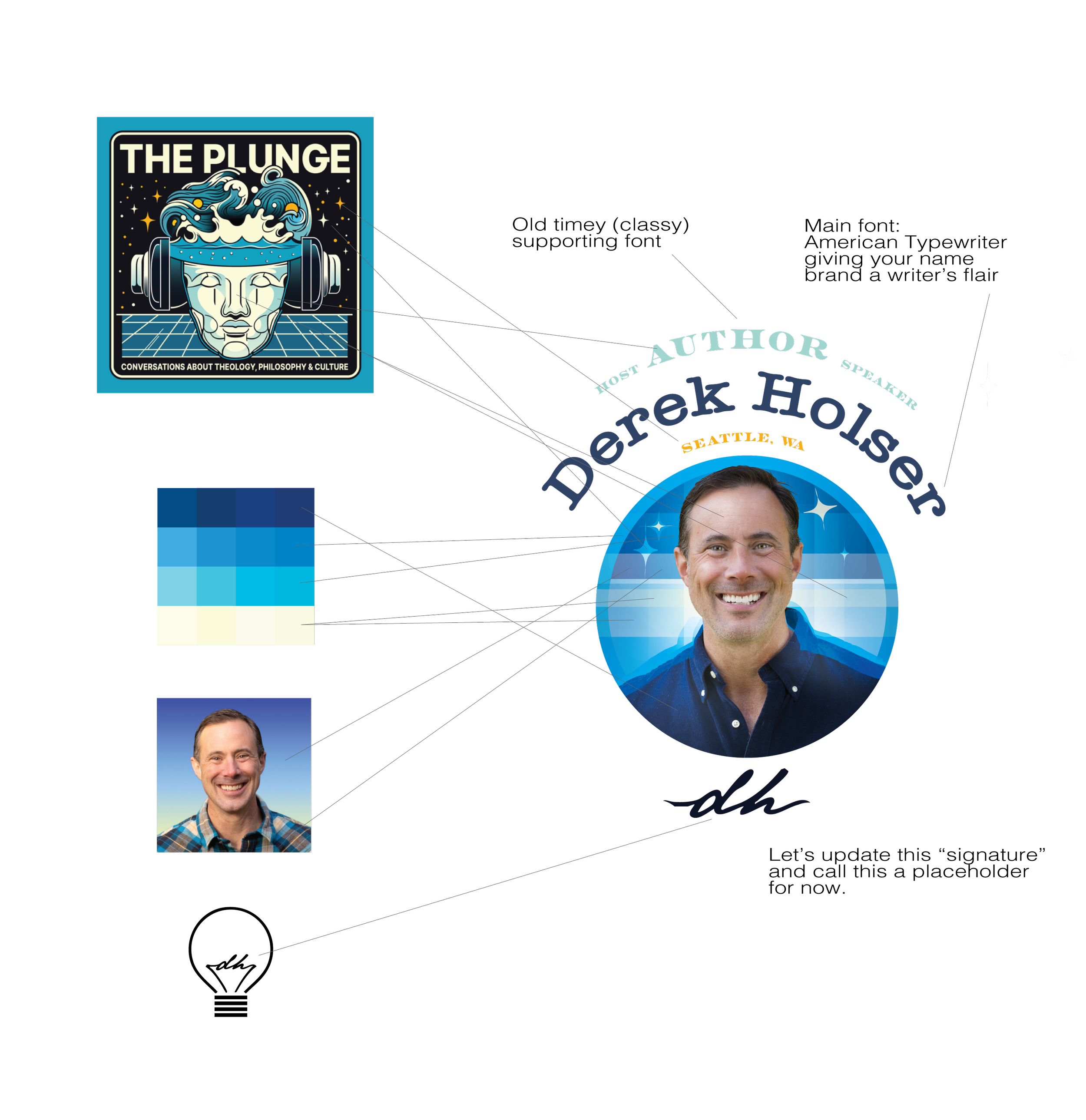
As you will see, the concept here is to embed an updated profile image into a logo setting. A diamond into a ring setting, if you will! Steering away from a logomark becoming your brand mark while leaning into the idea of using your image/likeness as the centerpiece, then building structure around it that could be placed onto your website, etc.
Click each sample to view IRL


Logo Anatomy
I’ve pulled over lots of the old colors and themes that were working well inside The Plunge logo based off your feedback. So, those waves, light, and your face were my main guides while using your old images as a style guide because it really has a positive “creative author” vibe that I wanted to build on.
If your headshot is our centerpiece—which I think should also double as a profile image for all your accounts—we need the design elements around you to be a “chilled out” interpretation of waves and light. We want people to notice YOU but not be distracted. So I’m doing lots of translating when I’m bringing over your fave elements…
Now on to your first look at the website.
Lots to do here still, especially with the copy, and image selection. This is just a first look. Be sure to load that Google Drive folder up with images that help tell your story.
Password: derek