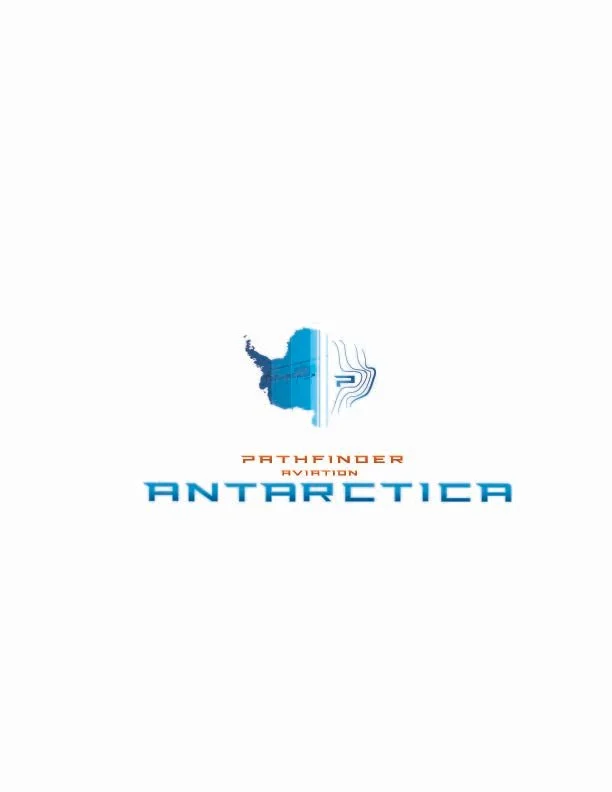
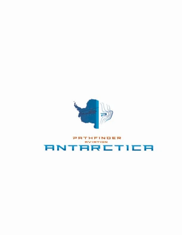
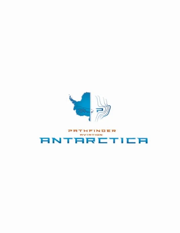
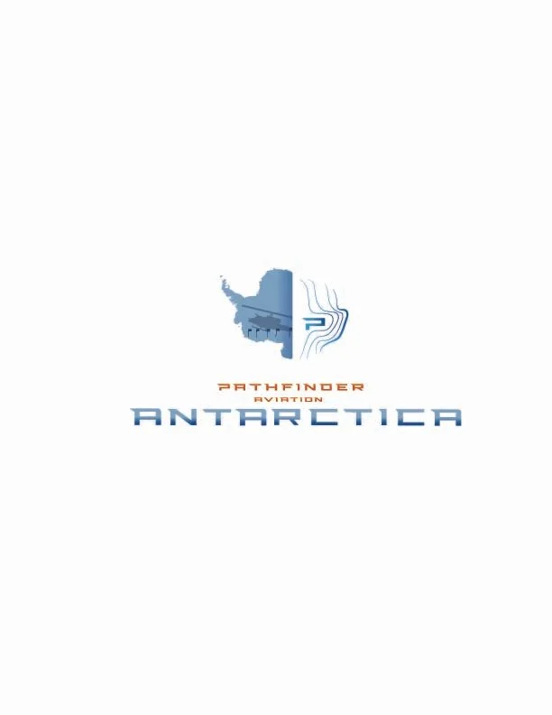
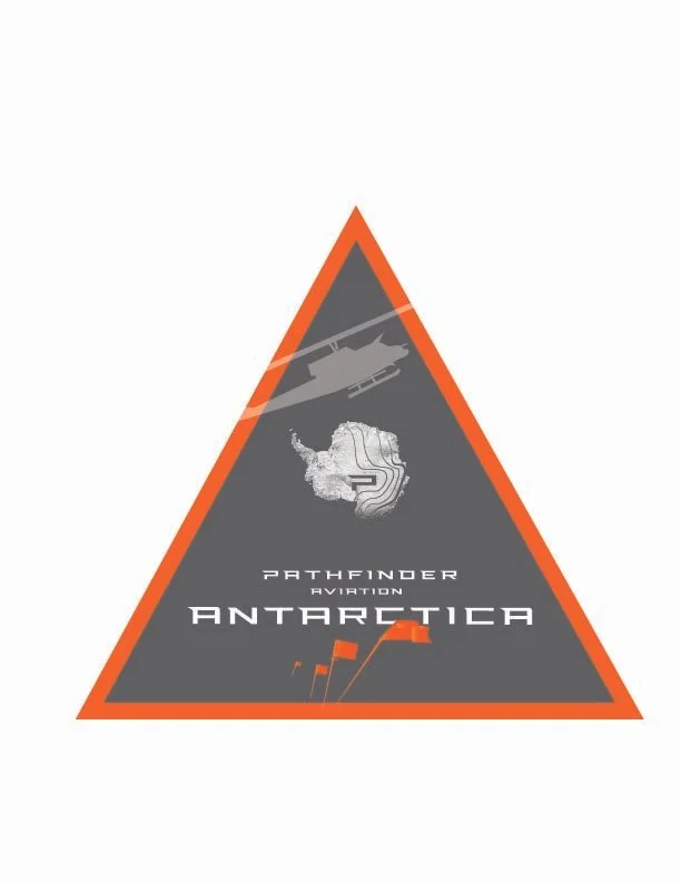
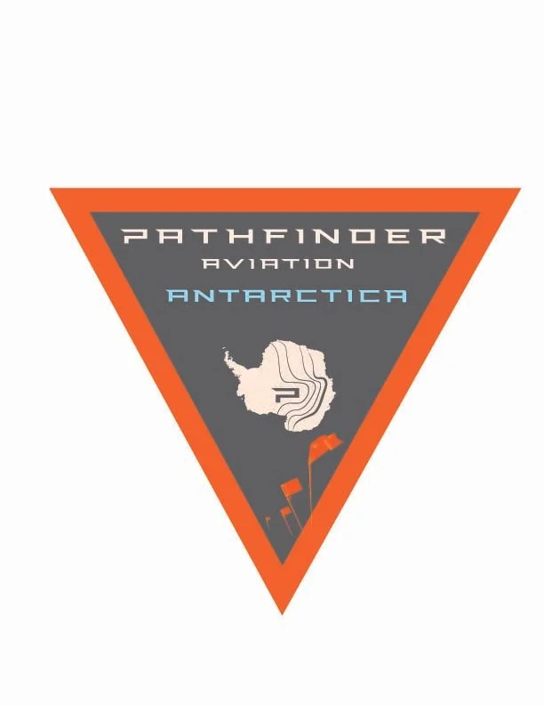
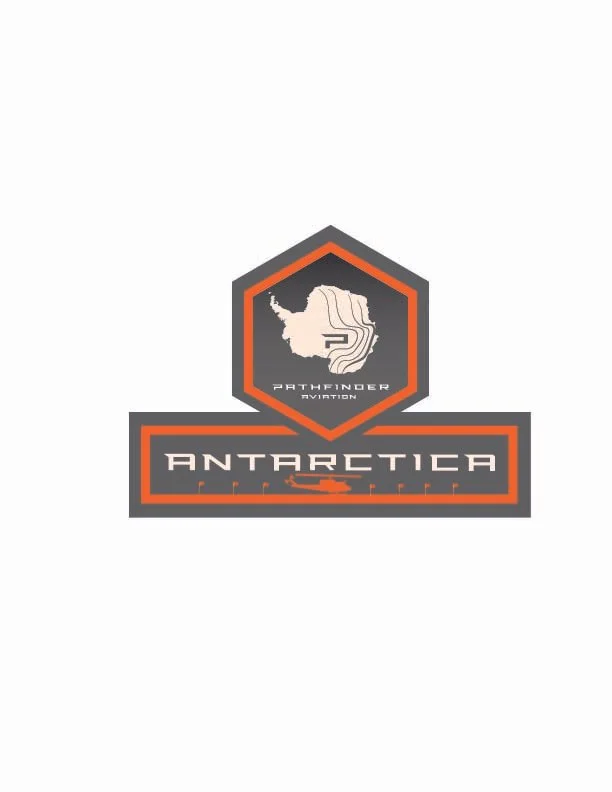
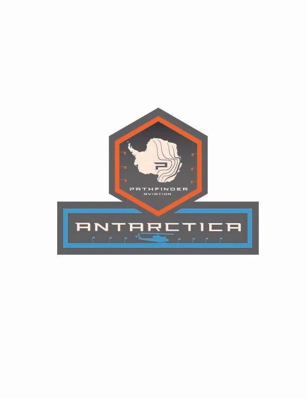
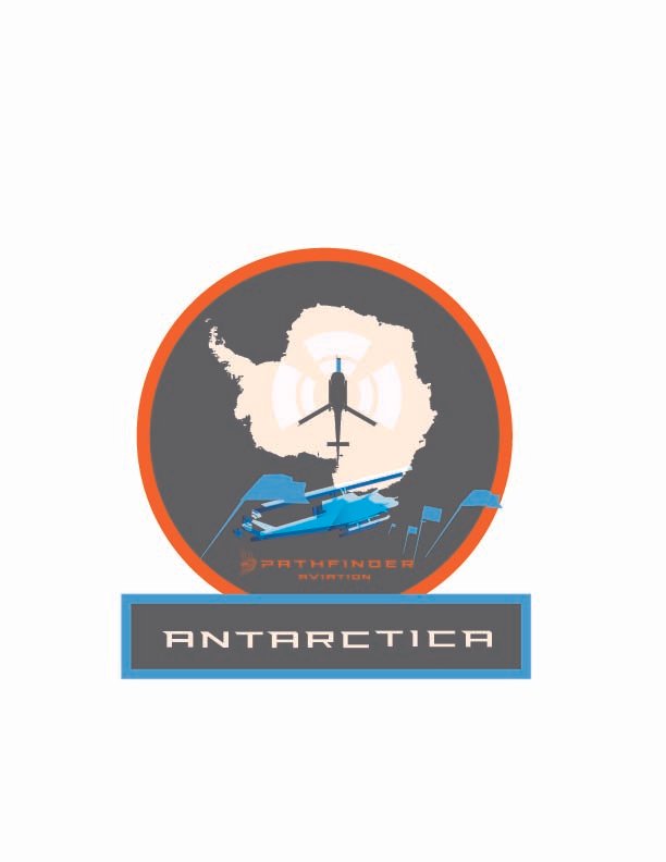
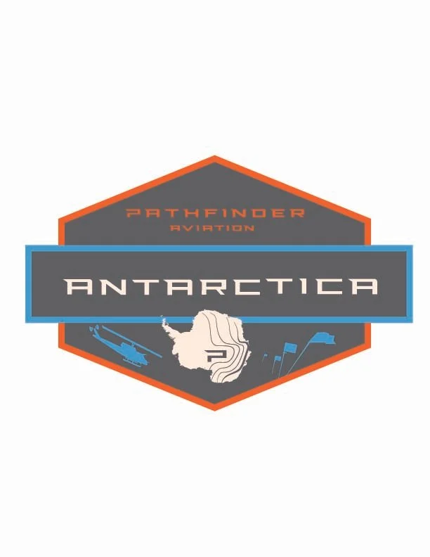
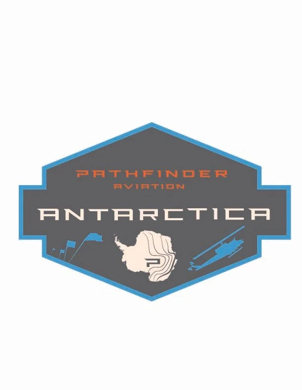
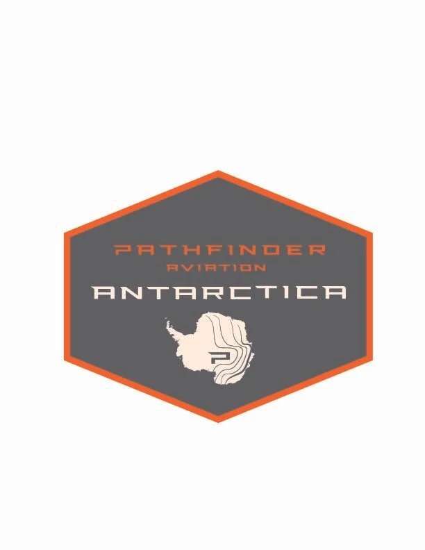
Round 5
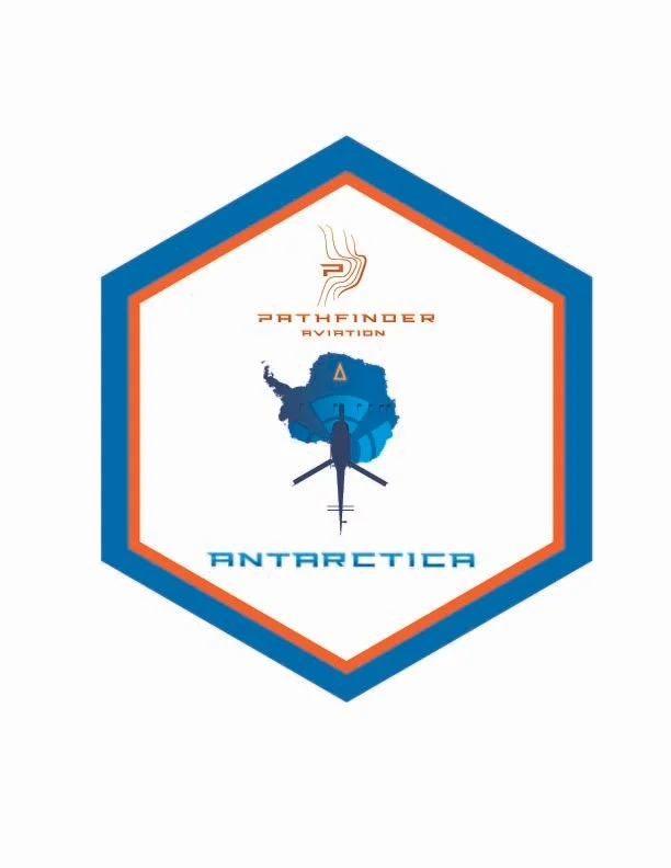
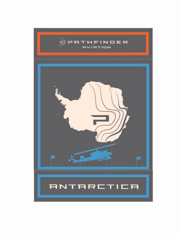
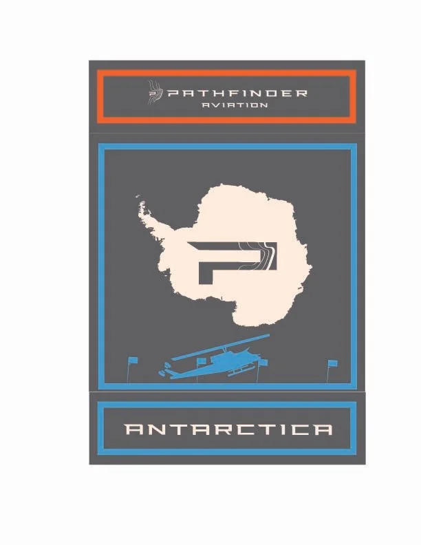
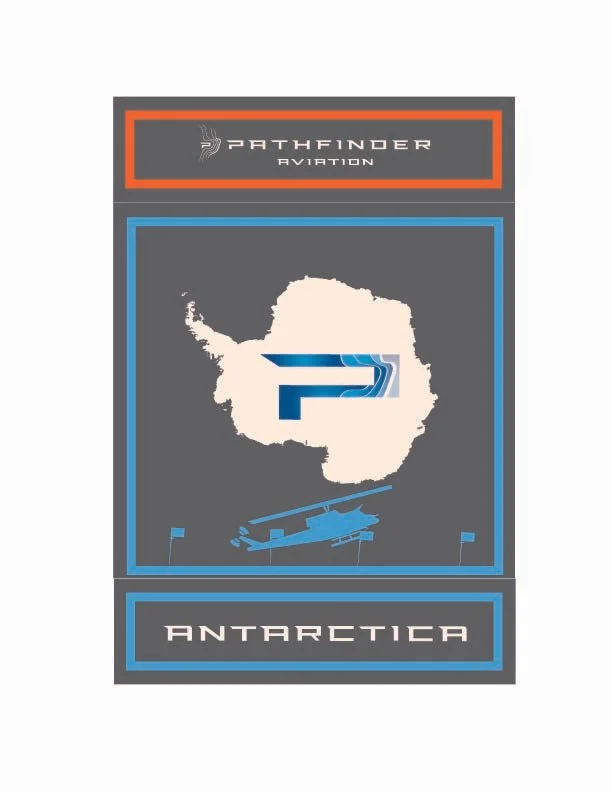
Design parameters for this round (note: some of these are very loose concepts just playing with elements, but 98% are more fully formed)
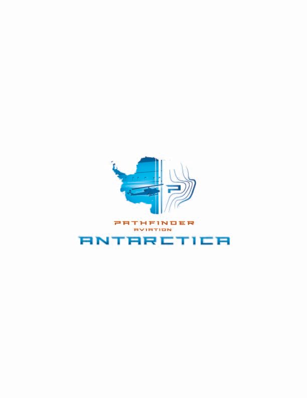
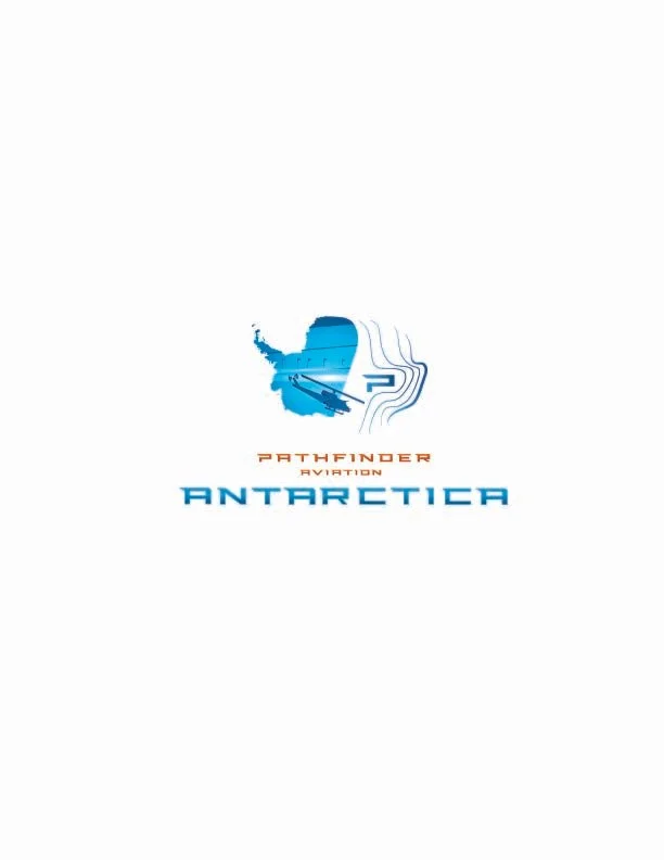
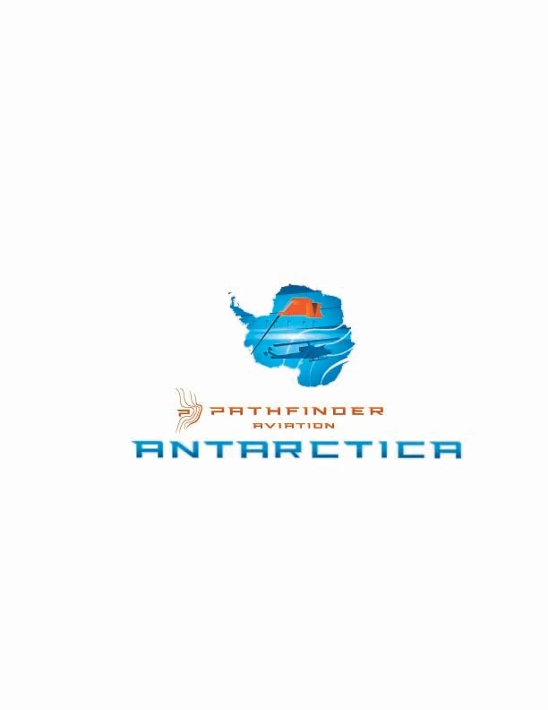
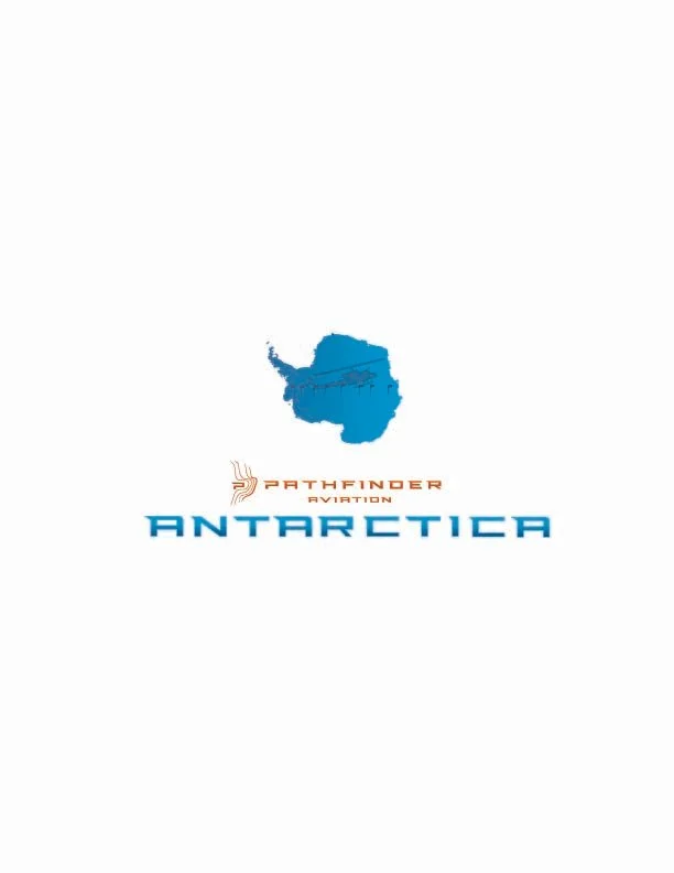
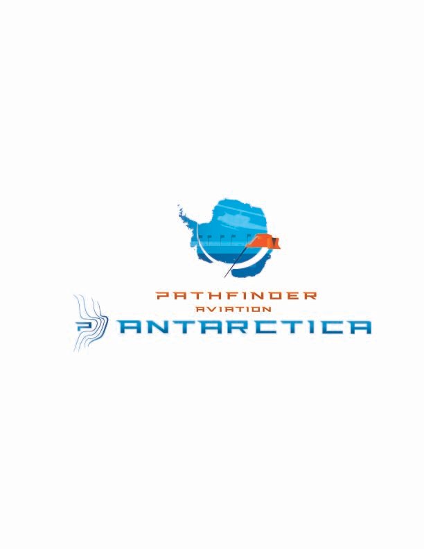
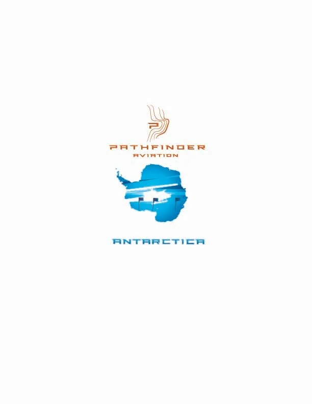
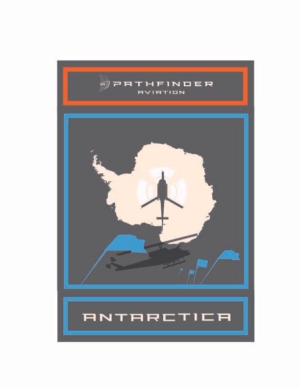
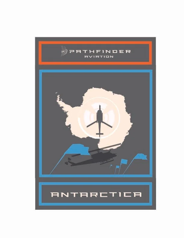
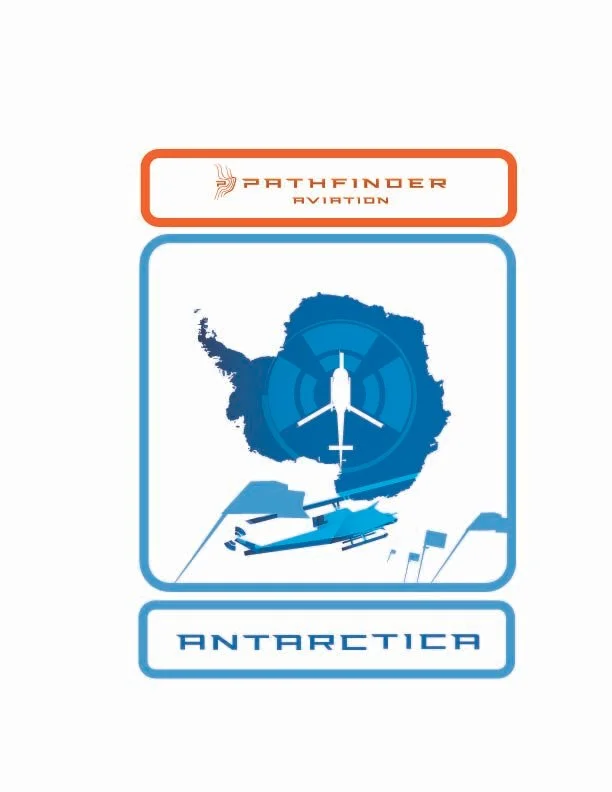
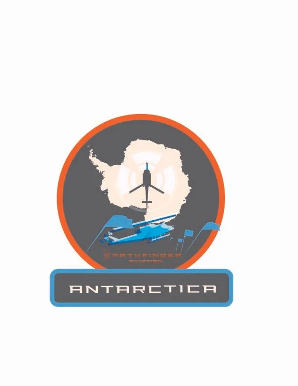
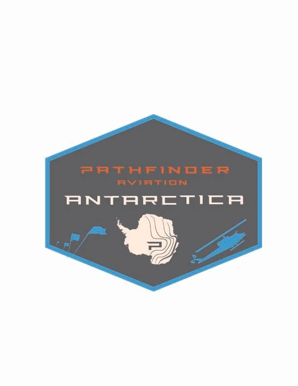
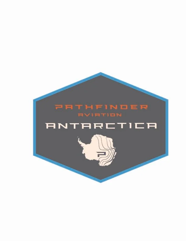
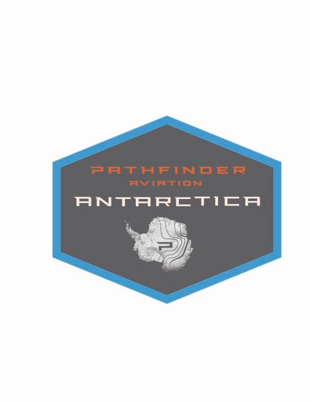
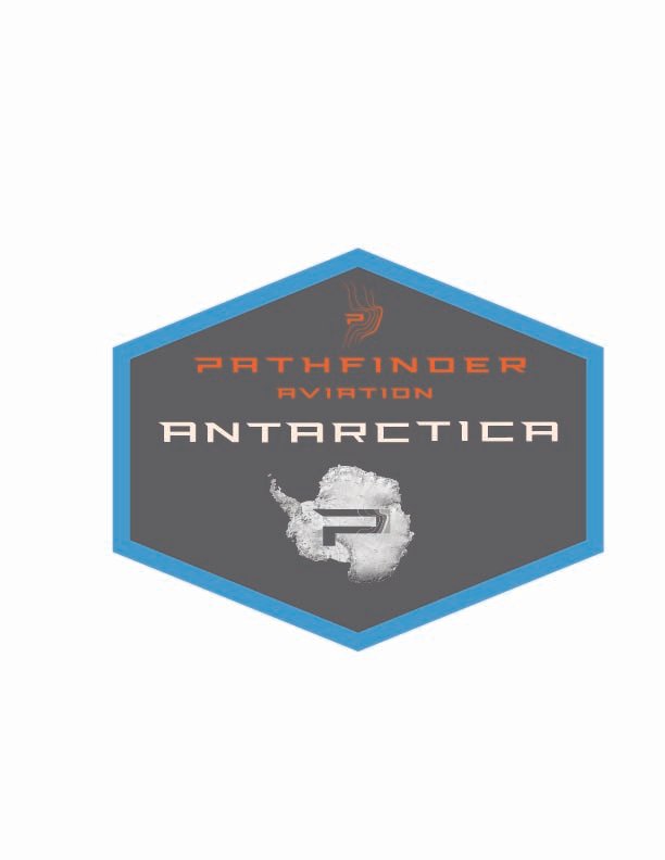
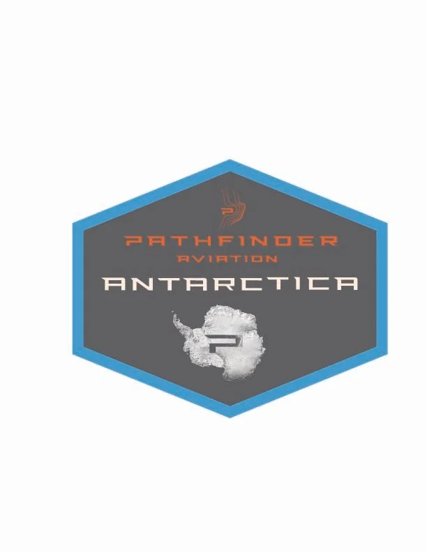
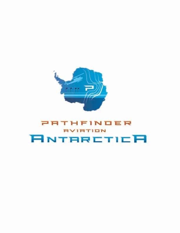
Friendlier continent shape, less agressive, more accurate. Including both major ice shelfs this time to give us more design space inside the Continent’s shape
Started with your sun dog concept, but without the sun dog (I thought it would add one more busy element) but tried to give us an “illumination” vibe by using light/dark tones for the ice & sky
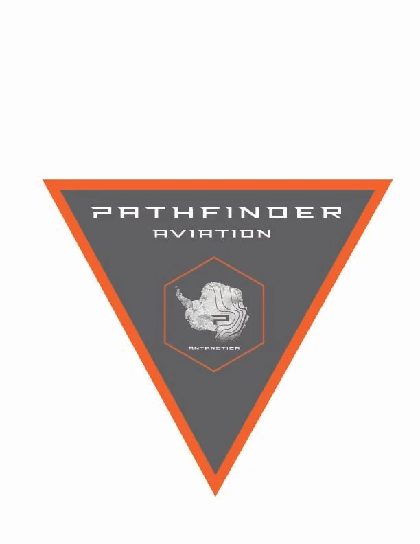
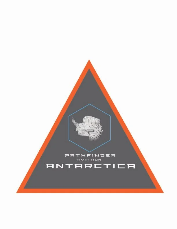
Using the topo P more prominently, and attempting to blend by using lines (vs blended color gradient)
Eliminated flags that promote Pathfinder conquering Antarctica, but keeping the flag vibe. Using clean flags, not weathered.
As I got into this round, I really feel like the “mission patch” look will be our best strategy. A patch is your most printer friendly option across: hats, stickers, mugs, shirts, patches. So that’s my recommendation.
No badass
No IMAX
Flat ice
No letter A, sticking with P
For this feedback round, let’s try something new that I think will help our process moving into the final week:
Review all of these, absorb them all. Slowly. Take notes only on what’s working for Pathfinder Aviation’s Antarctica mission.
Screenshot the ones you like
Email me your screenshots & notes about what’s working (or upload to something collaborative).